
What a dull title.
I could have called it ‘That Elusive Thing’… or ‘We Almost Never Eat on The Coffee Table in The Lounge in Front of the TV, Honest’
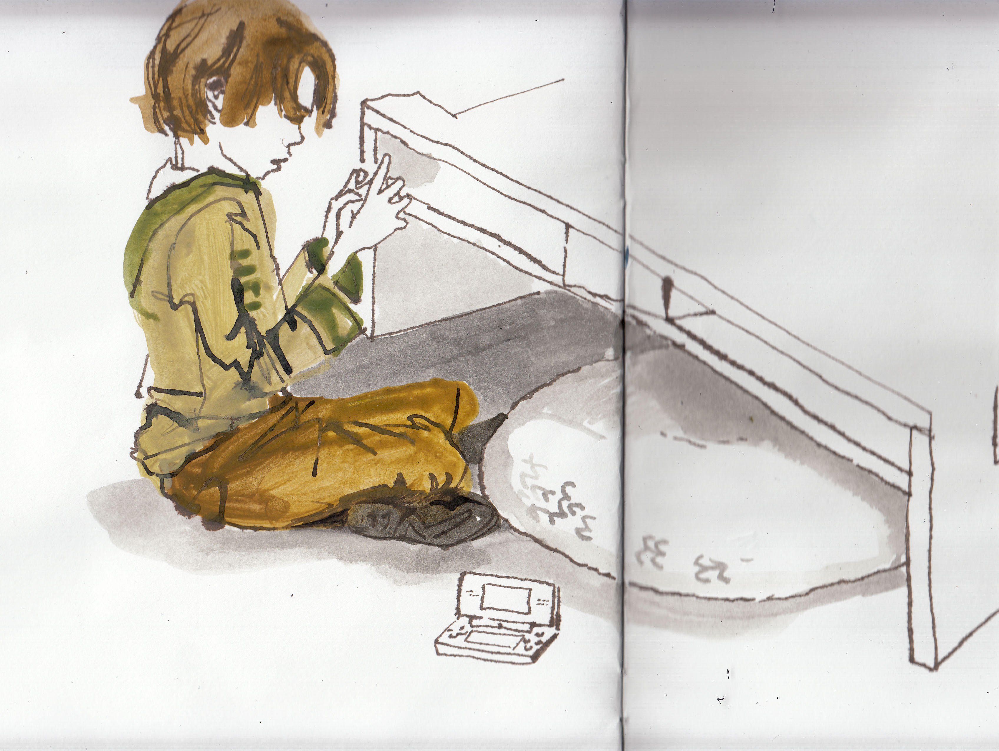 I drew this with a dip pen, in situ and used acrylic to paint and draw almost at the same time. Of course the coffee table is skew-wiff and Sam, my son, is all out-of-proportion but that’s all fine because there was something instantly likeable about this for me. Maybe it was the white space, the use of colour (I paid heed to the things taught in Jane Human’s colour workshop), maybe the speed… not sure. But there is definitely something here that I love – now what is it? What is that elusive ‘thing’? And why is it not in every drawing that I do?
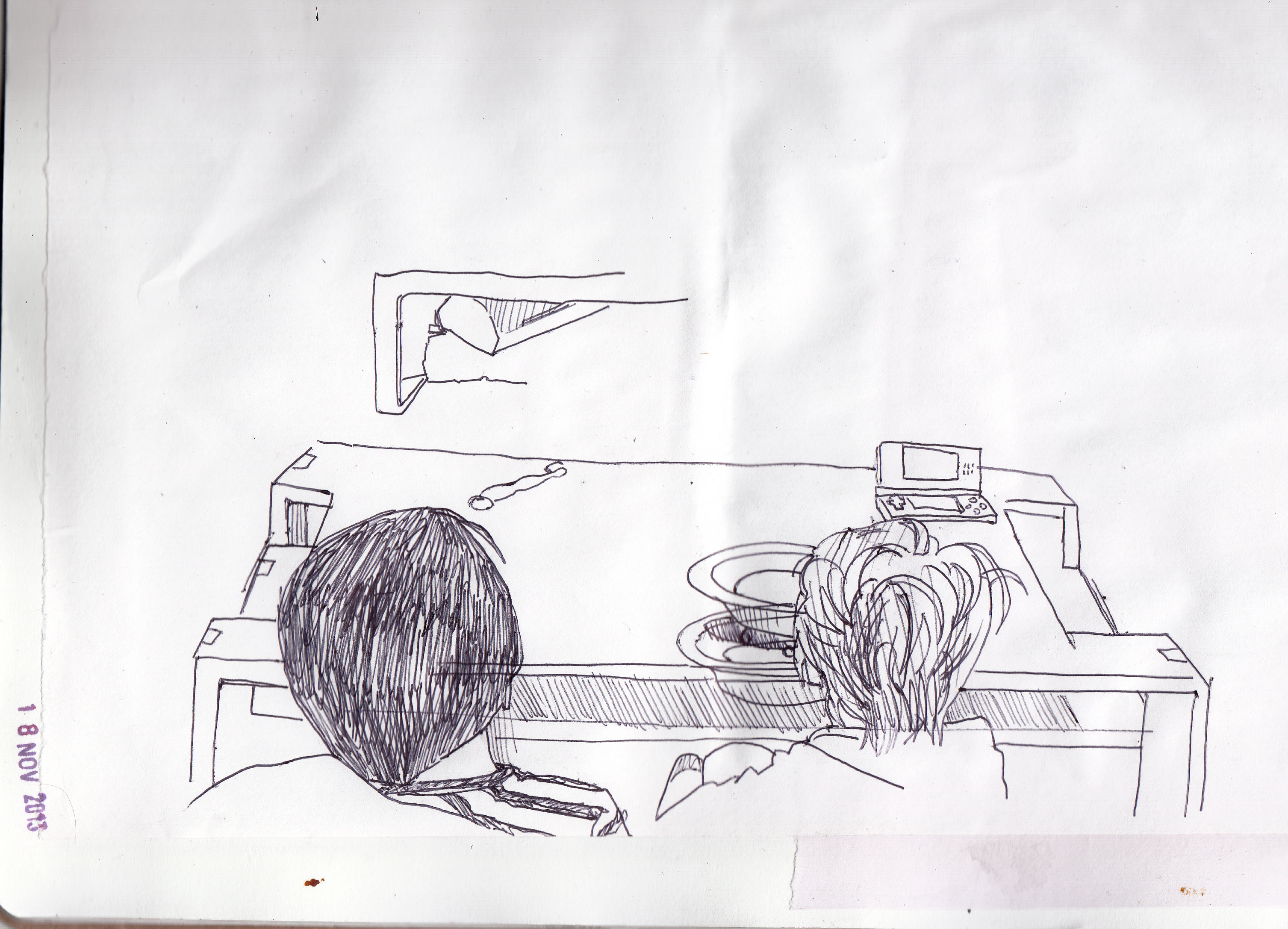 Small Biro sketch – had to stop it when I was ‘on a roll’ probably for something motherly such as making tea, running a bath or toilet duties. Same subject matter as above though (there’s a theme developing here).
 Another version of the above, probably drawn on the same day (I have given-up date stamping by this point), not well-drawn – but I like the cups and the white space, bold flat colour… something about it anyway.
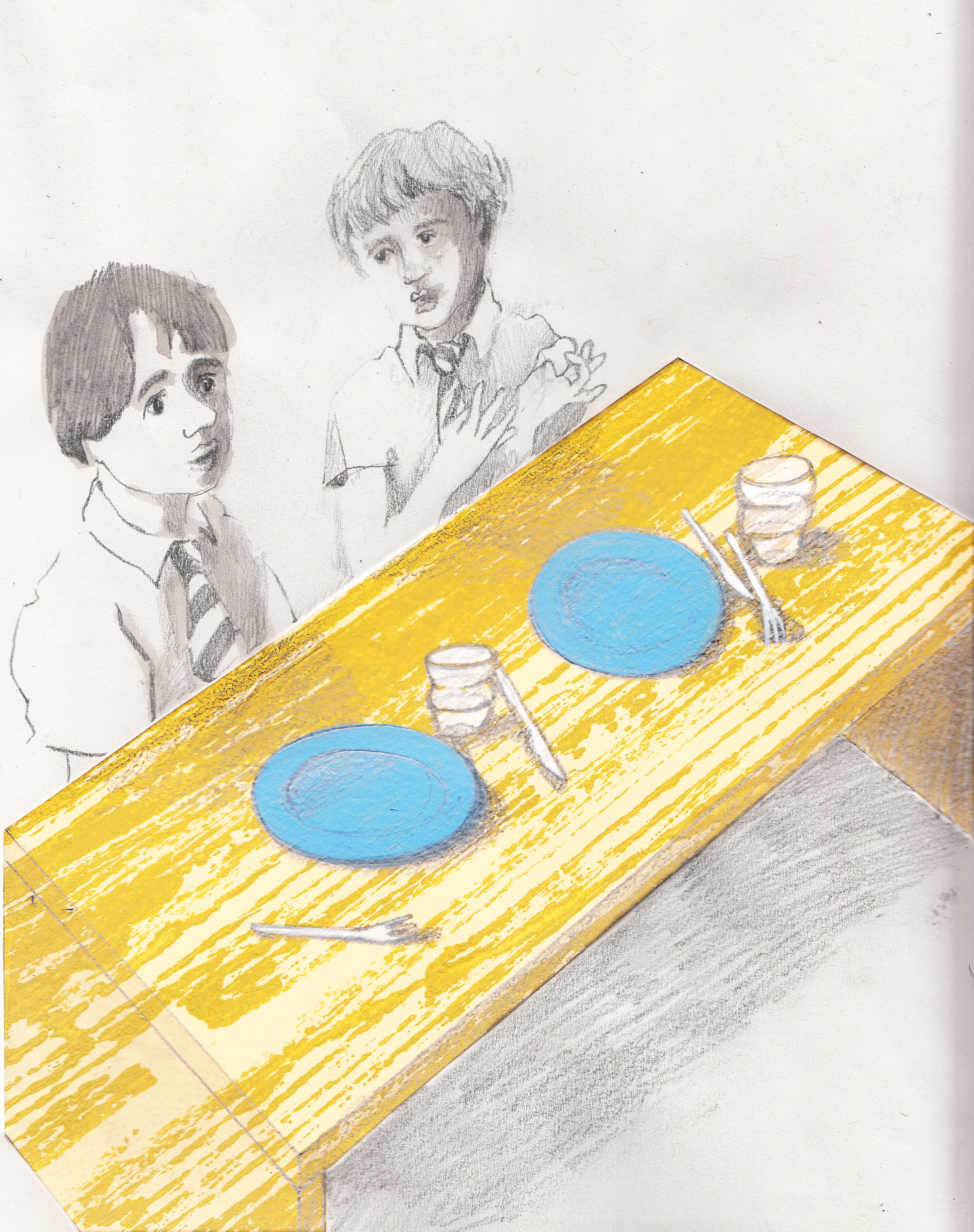 Tee hee. So again, I don’t think this is perfect (OK, so I know that day will never come).. but I am pleased with a few things here.
Number 1, the texture – printed from an old bit of driftwood I’ve had kicking about for ages.
Number 2 – the boys are drawn from memory, more or less – although the pose is taken from the incomplete study in large sketchbook above. It’s the first time I have really attempted to draw totally from imagination/memory and actually not entirely loathed the result. And they even look A BIT like Sam and Alex – a little cartoony with the differences between them exaggerated, but I’ve not got a problem with that. It does say ‘Sam & Alex’ to me. I have realised how even a little bit of info drawn from observation can help to recreate a figure afterwards.
Number 3 – the viewpoint/strange perspective and the drinking glasses.
I’ve mucked around a bit with the contrast and the colour of the bench from the actual artwork drawn, but that was in order to improve the drawing. This gives me a feeling of confidence that I am beginning to know what I am aiming for and what to do to get there… the coffee table actually had a greater tonal range which helped it to make sense despite the wood ‘grain’ print going all the way through it, but this was altered in my re-balancing the colour, brightness and contrast post scanning.
Overall then I suppose the final part of the semester wasn’t all bad. If I can fish-out any other little bits I actually liked, I’ll add them here – so visit again, you never know!
As from tomorrow when my work is handed in for assessment, I am going to concentrate on a small poster commission for Chelmsford Morris. Quite excited about it as I have what I think are a few good ideas. Will post here when I’ve done a few.
And then there’s my live events drawing business…. now what was I saying about managing a realistic pace?
Anyway, do keep visiting my blog as your interest in my work is very encouraging – and make comments if you like, I’ll do my best to respond to you. Thanks!

Keep going! I have never doubted your creativity, passion and spirit. Fear No Art. All the best for 2014. J x
Thanks James, that means a lot. N x