Ah yes, it’s that time of year again.. when daffodils spring to life, the birds sing, frogs spawn and Morris Dancers start putting their bells on.
Actually, for Chelmsford Morris the season doesn’t begin in full force until around about St George’s Day, or early May. So, a bit later than daffodils.
This year I am privileged to have been asked to re-think the Chelmsford Morris posters as the old one was great but it’s been in use for a few years now. These are the posters that tend to go up in pubs to warn the locals to keep away that week…
I thought I’d share with you the results of that work:
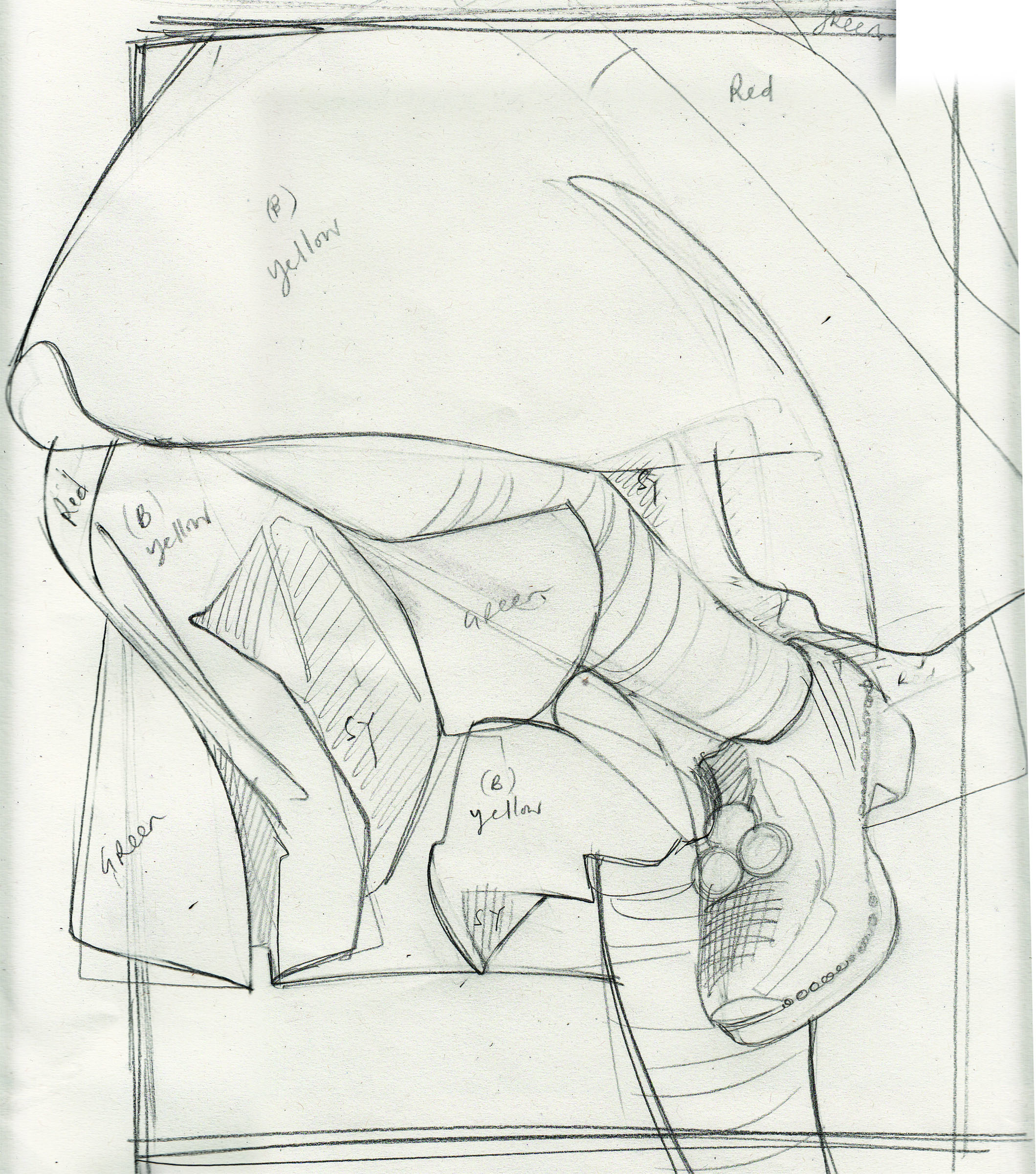
 Initial sketches for the ideas… there is one for the ‘arm’ design but I don’t think I’ve scanned this.
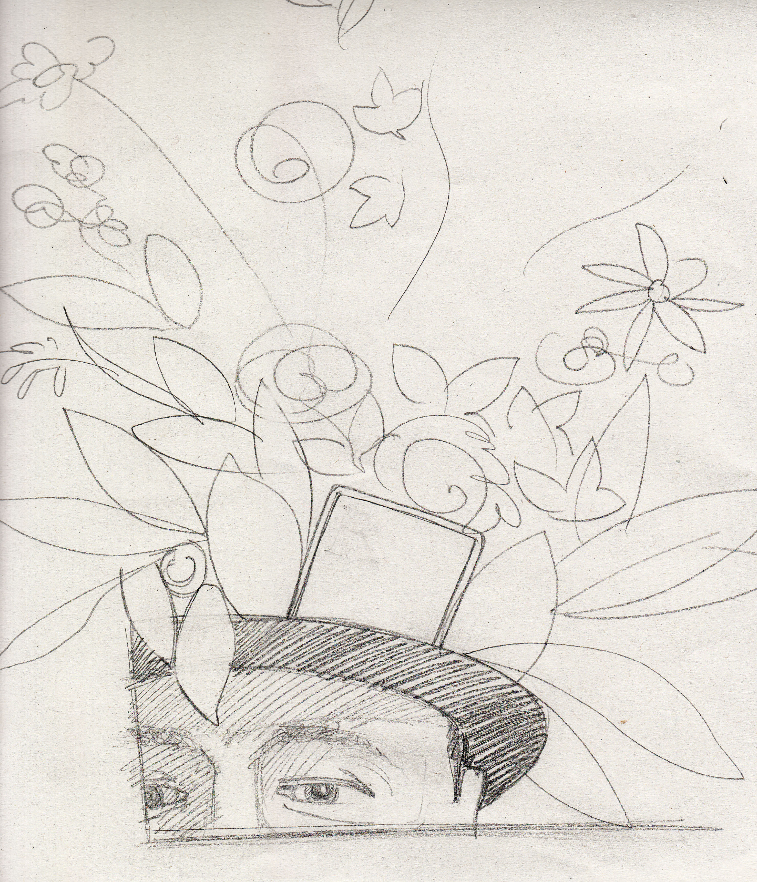
 In this version the collage looses the ‘fluidity’ that the sketch has. And I decide the leaves need to be smaller and more numerous. Which leads me to the following design:
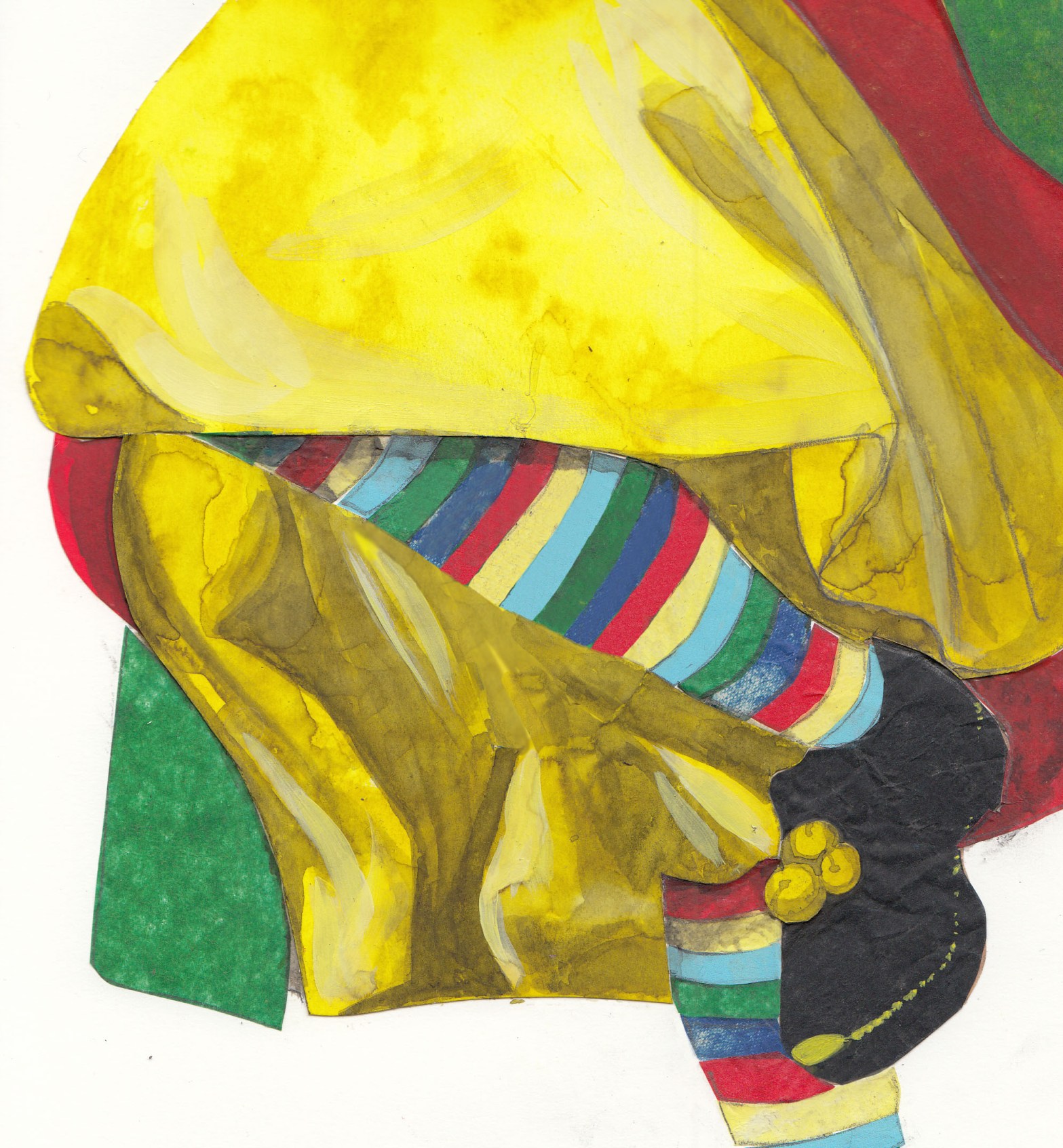
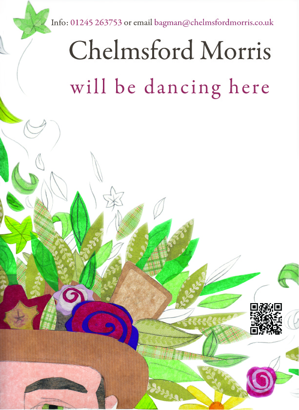 I like this – but it was rejected by ‘The Morris’ on the grounds that it doesn’t have very much to do with dancing. They’re right but it is such a good image! I guess I was just being a bit self-indulgent when I pursued it… well, it was inspired by a REAL hat (although from another Morris ‘side’).
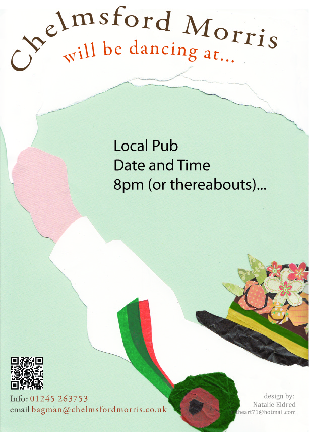
 This is a pre-finalised design actually, the final design is better, despite being composited in Word (and why it isn’t uploaded here). This was necessary as various Morris Members will need to edit the poster to change dates, venues etc – so it had to be available in a simple software program that everyone is likely to have. Bit frustrating trying to handle large print-quality images in Word though.
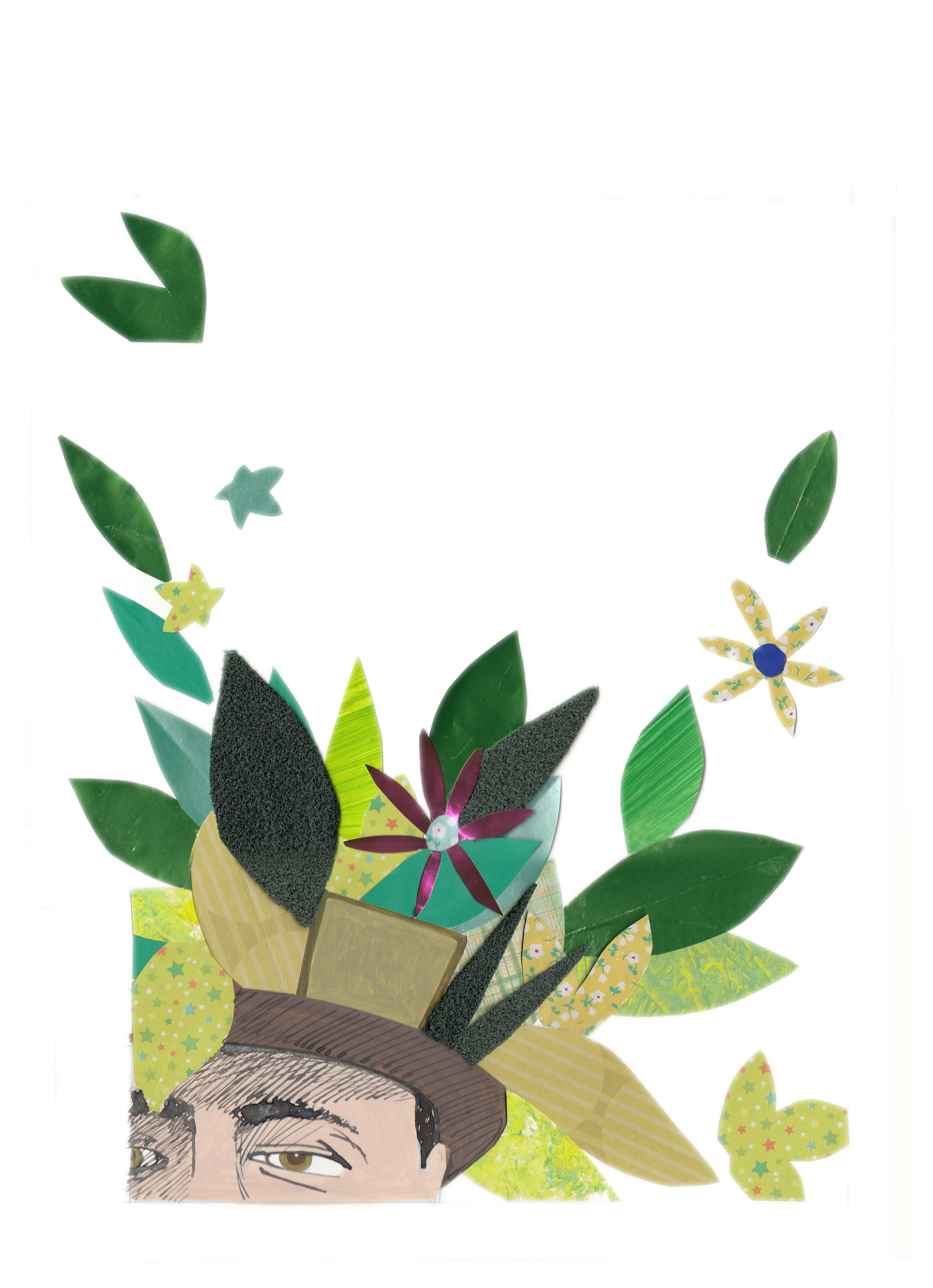
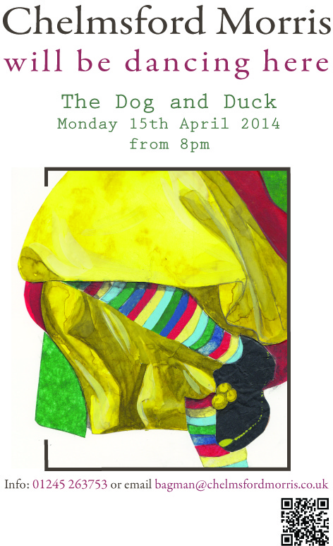
 Well, this is my personal favourite design – due to the simple composition and minimal detail. I really like this. The hat had to be done twice because the first version was based on a photo, but the photo was obviously of a non-regulation hat, because the flowers were on the band!! Not above them, as all good Chelmsford Morris hats should be.
I haven’t done much with the fonts, because it would take a while and probably involve purchasing new ones – so I have used standard ones close to the font that Chelmsford Morris used before. So that probably gives away that I am not a ‘true’ graphic designer with a real passion for typeface and font – as seductive as I know it is. I mean, one can waste hours on font websites, choosing between bold and semi-bold or italicised, condensed or whatever else.
So these are they; so far at least. Hopefully coming soon to a pub near you (well, if you live in Essex)…

Love them all Natalie. The armband on the morris man is not in Chelmsford colours otherwise its an excellent design.
Hi Stephen, hmmm. Celia told me about the arm band colours and I thought I’d corrected it according to her instruction. So what should the colours be? They can be changed easily enough.
Thanks for the comment tho, glad you like them.
Hi Natalie, unless they have changed in my absence they used to be green and orange. I’ll send you a photo to your phone.
Actually just realised it is green and orange – maybe a tad dark, and has come out very dark on screen.