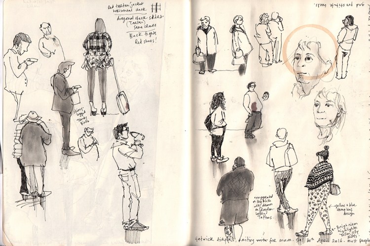
Above are the figures as drawn in my sketchbook. I have been meaning to try drawing people in a slightly exaggerated way, and an airport appears to be a good place to do this. It’s only a mild exaggeration, a gentle characterisation…although here some are more exaggerated than others.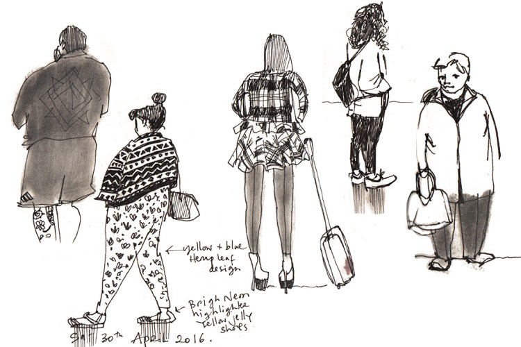
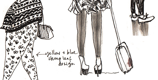
In the image above I’ve extracted the figures from the background of my sketchbook and enlarged them. It’s something I’d like to explore further, as it helps the mark making to become central to the drawing. It works really well with the pastel marks but the pen, not so much.
My next job with these is to play around adding colour. It’s still something I lack satisfaction with and so I guess I’ll try pencil crayon as it’s the technique/medium I like best for colour. I find using digital colour leaves the drawing a little flat.
But I am really loving the tonal grey (that pastel again, see previous post)… but to use that same mark making technique for colour wouldn’t work well – I don’t think it would anyhow. Look out for my next post to find out more about how that goes.
